Start from an object
Not a moodboard. One thing everybody has held, and a promise it already makes without being explained. The mark came out of the object rather than out of a shape hunt.

Brand, guidelines and architecture for Compane, a platform built to start, run and automate a business. Then the experience on top of it, and the customer's voice inside the build.
Scroll. The plug and the contacts find each other.
The challenge
Compane exists to start, manage and facilitate businesses in a digital era, with automation and a customised experience. That is four promises in one sentence, and a brand has to carry all of them without explaining any of them.
The idea
Plug and play. The thing Compane promises is the thing a USB stick promises: it goes in, it works, nobody reads a manual.
So the wordmark is drawn as a connector. The capsule is the housing, and the final E is not a letter at all, it is three contacts. Read it once and the name still says Compane. Read it twice and it is a plug.

One geometry. Everything else is drawn from it.
The system
Construction
X
4X
Height is X, width is 4X, the contacts are 0.4X. The monogram is X by X. Nothing scales on its own.
Variants
The wordmark, where there is room for the name.
Colour
One coral doing all the signalling, three neutrals doing everything else.
Type
Set wide, in capitals, with the letterspacing that makes a small line read as a considered one.
On paper, and on screen
Card, front
Girish SedambiCEOgirish@compane.coCard, back
App icon, in place
The product
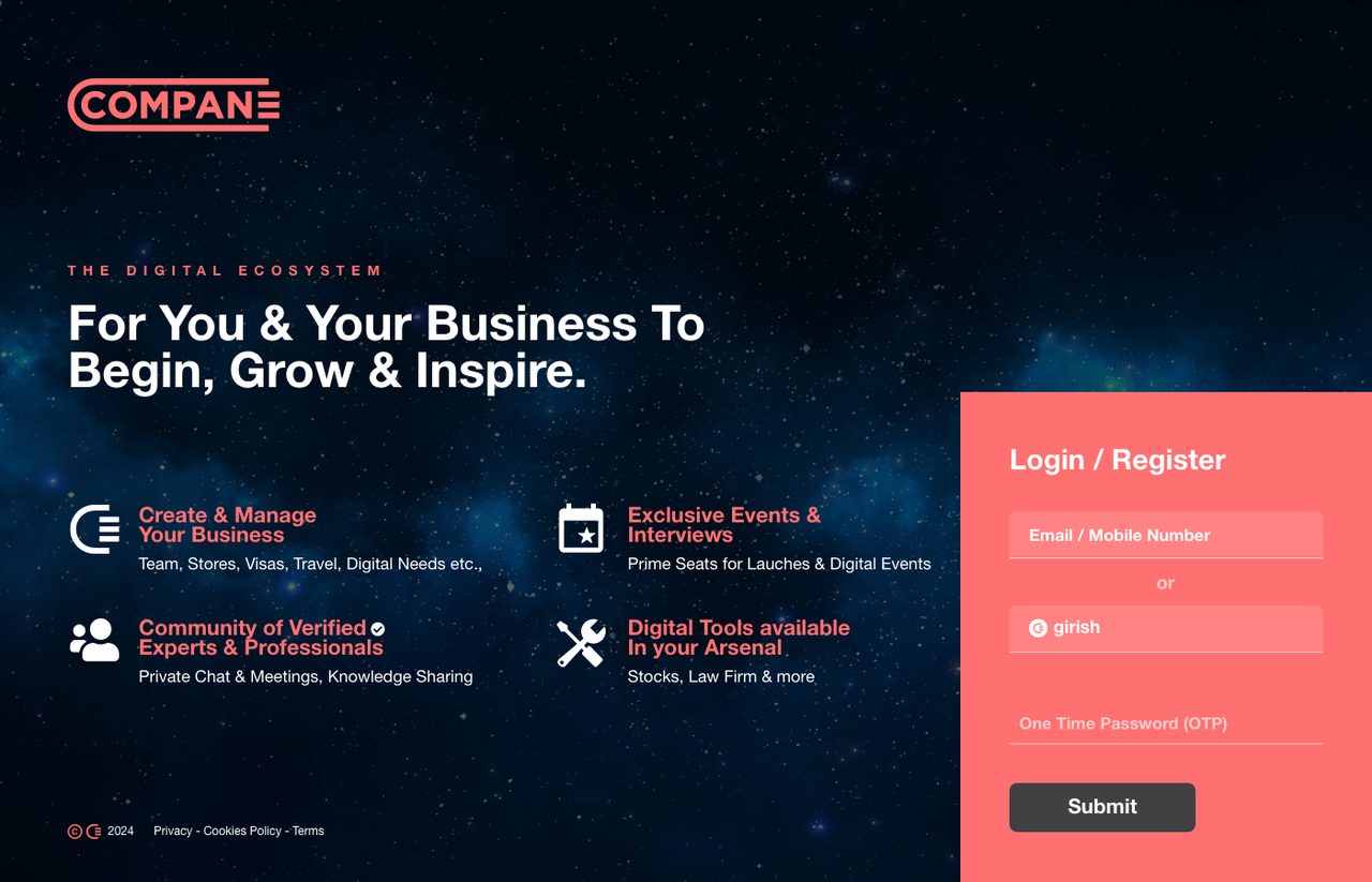
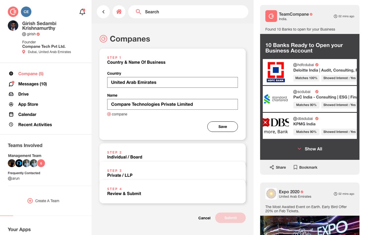
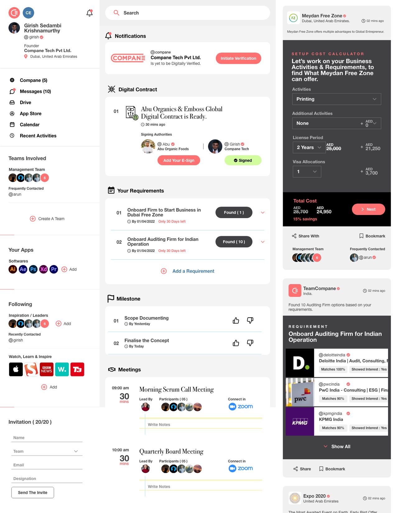
The way inOne screen that says what the ecosystem is for before asking for anything. Sign in by handle or by number, no password to forget.
Architecture
Foundation
Start
Run
Grow
Everything hangs off one verified handle. A person, a company and a provider are the same kind of object with different permissions, which is why a contract, a team invite and a marketplace match can all point at the same record.
The flow
By handle or by number, with a one time code. No password, because the first thing a new business owner does should not be inventing one.
Eight steps, and the customer was in the room for most of them while the build was happening rather than only at the start.
How the work was done
Not a moodboard. One thing everybody has held, and a promise it already makes without being explained. The mark came out of the object rather than out of a shape hunt.
Construction, proportion, clear space, variants and one stated don't. Written for the printer and the developer who would never speak to me, not to look impressive in a PDF.
What the platform is made of, and what belongs where, drawn before anything was designed. Identity at the root, then start, run and grow hanging off it. Get that wrong and every screen after it inherits the mistake.
From signing in to a company that runs, as one line rather than a set of screens. The seams between steps are where a new business gives up, so the seams were designed first.
In the room while it was being made, not only before it started. What they said changed what was being built, which is the only version of research that pays for itself.
Beyond the mark
An identity is the easy half. The rest was the architecture, deciding what the platform is made of and what belongs where, then the experience drawn on top of that structure.
And the customer stayed in the room during development rather than only before it. What they said while the thing was being built changed the thing being built, which is the only version of research that pays for itself.
Happy to walk through the routes that were rejected and why this one held.