Went to the business
Inside the operation rather than across a table from it. What comes in, what it becomes, and who moves it.
Campaign · Recycling · United Arab Emirates
Branding and art direction for RISE, a recycling business in the UAE. Made after travelling with them and watching the work, not after reading a brief about it.
The challenge
Recycling is treated as a duty, and duty is the weakest thing you can ask of anybody. Everything in the category looks the same: a green leaf, three arrows, a soft blue sky and a plea.
How I got there
I went to the business. Spent time inside it, understood the model and where the money actually comes from, heard the vision from the people holding it, and travelled with them.
The campaign came out of that rather than out of a room. Co-created is a word that gets used loosely, and in this case it is accurate: they were in it while it was being made.
The name
One word people already use as an instruction, and a sentence hiding inside it. Say it out loud and it is a call to action. Read it down and it is the business plan.
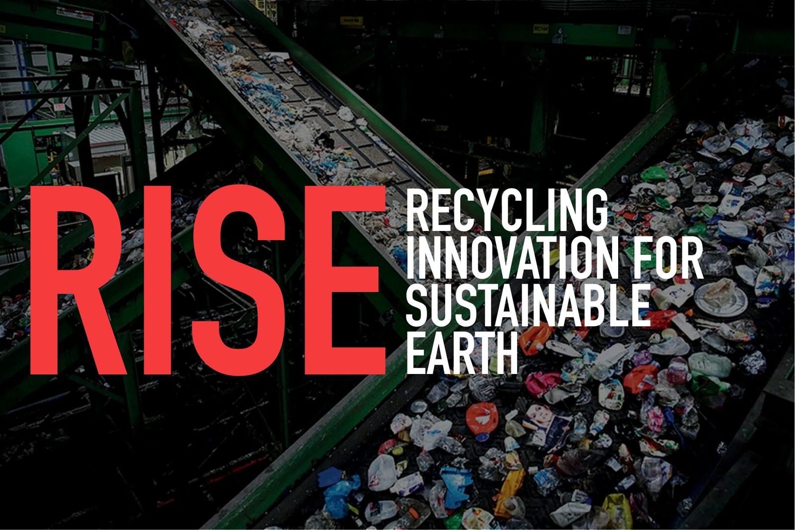
The plant, at the scale it actually runs at. The line is the hero, not a leaf.
The art
The gesture
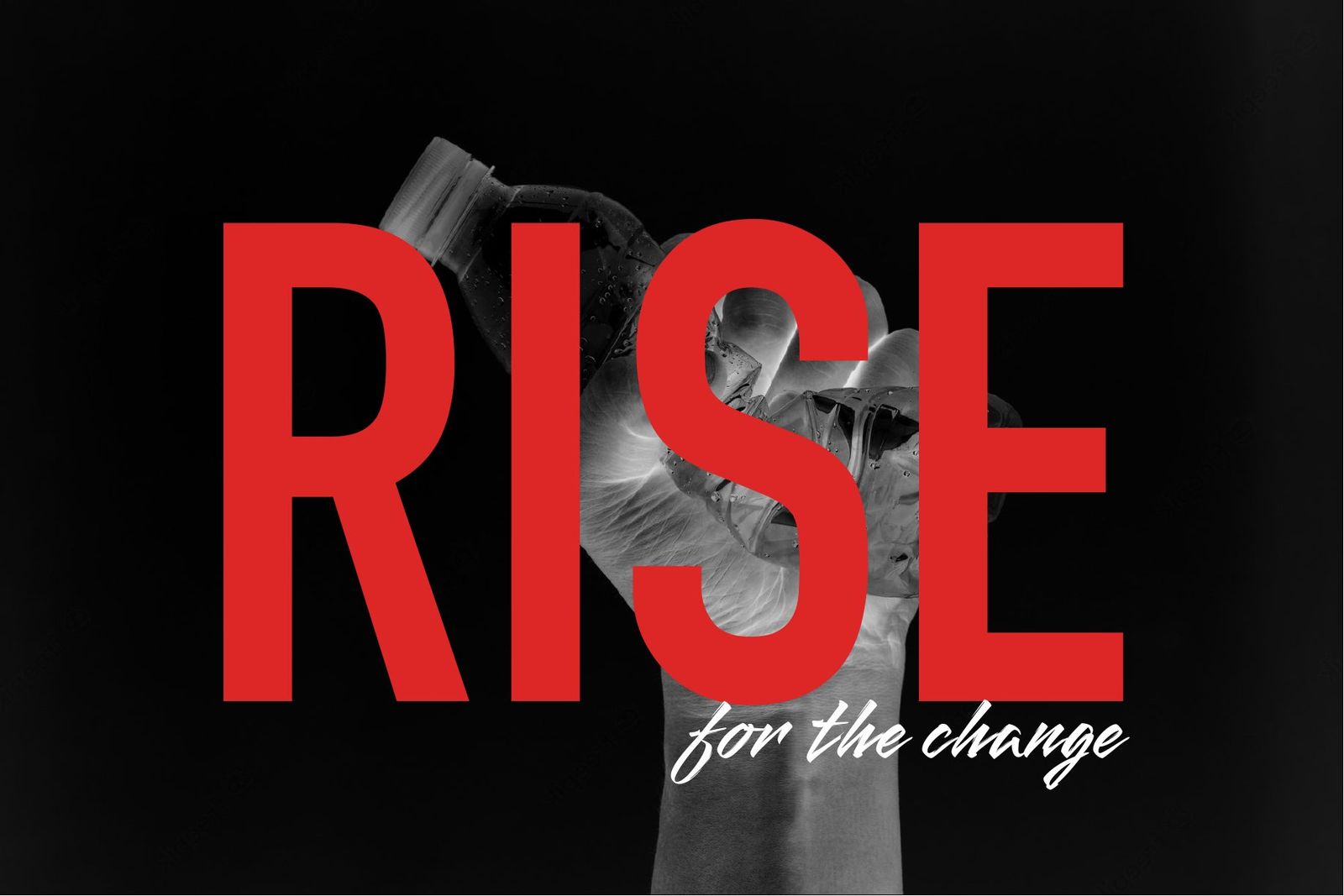
A raised fist is a protest, and the thing it is holding is the thing being protested. Crushed, still in the hand, not yet thrown. The word sits over the top so you read the instruction before you read the image.
The mark
Black on red, tight, with the registered symbol carried openly. This is a business, and the mark says so before the campaign says anything else.
Worn
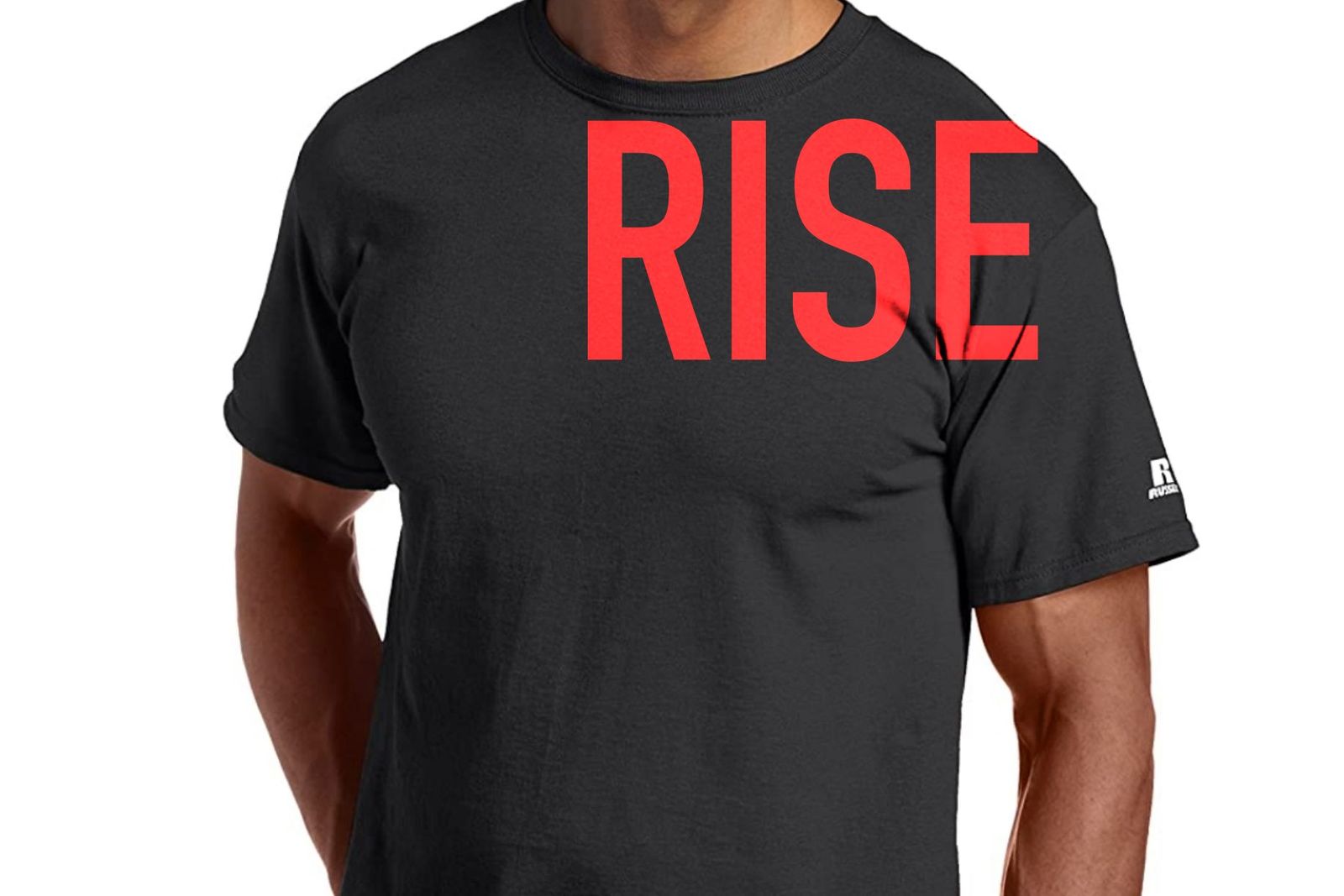
The word off the poster and onto a person. A campaign about taking a stand only works if somebody is willing to wear it.
The second colourway
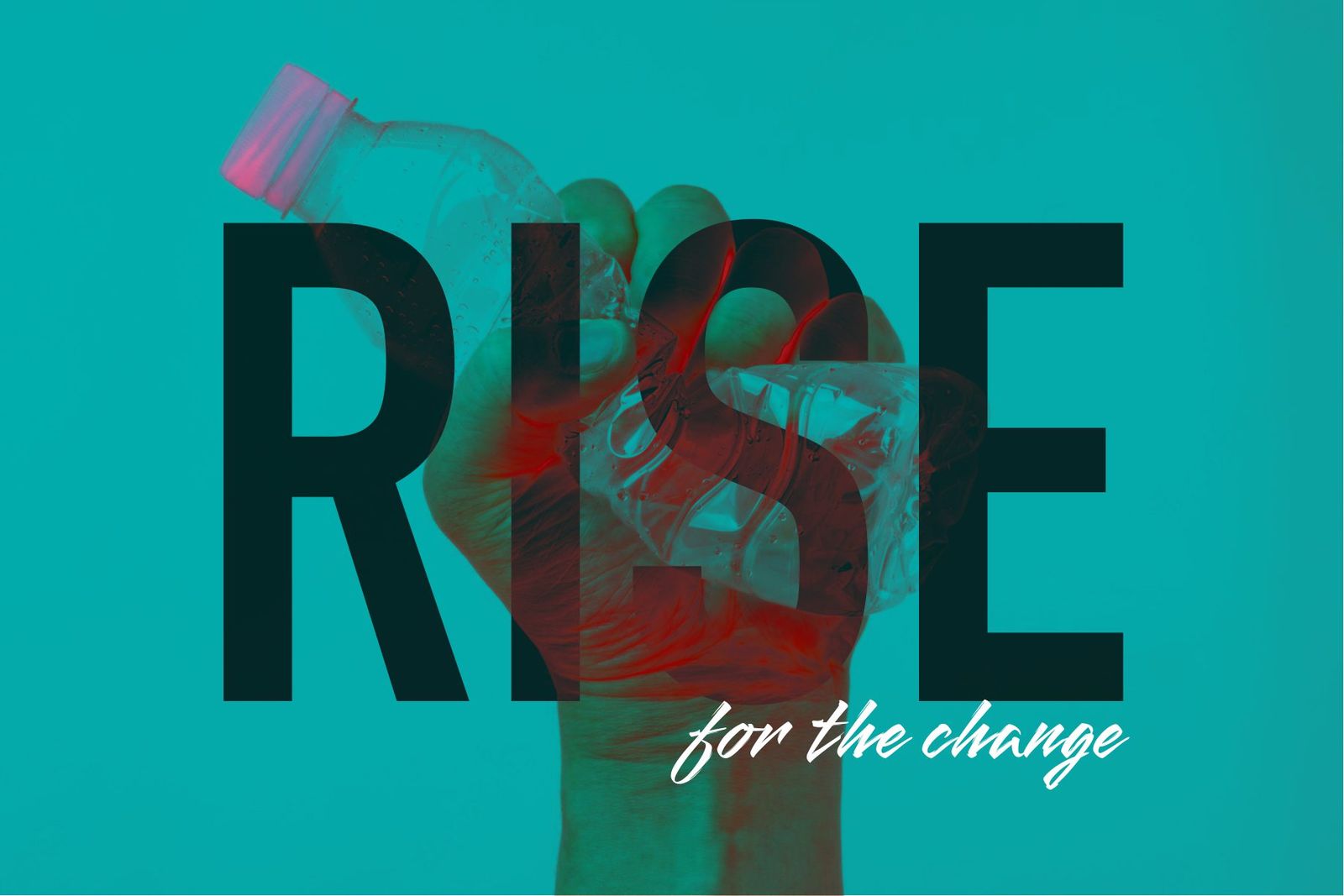
The same frame in a duotone, so the campaign can run twice without repeating itself. One idea, two temperatures.
How the work was done
Inside the operation rather than across a table from it. What comes in, what it becomes, and who moves it.
Where the revenue actually comes from, not the version on the website. A campaign that ignores the commercial reality gets pulled after one cycle.
Travelled with them and made the work alongside them rather than presenting to them at the end. The name, the gesture and the line came out of that time, which is why nobody had to be persuaded of it afterwards.
One image, held. The gesture, the crop, the colour and where the word sits over it, so the campaign is recognisable at any size and in any medium.
Poster, plant, garment and a second colourway. Enough of a system that it survives being made by other people, in other formats, later.
What came out of it
A name that carries the whole mission in four letters, a mark that reads as a business rather than a cause, and one campaign image strong enough to run in red, in duotone, on a wall and on a shirt.
[Outcome line: anything you can say about reach, response, or how long the campaign ran. Even one is worth having here.]
Happy to walk through the trip, the routes that were rejected and what the business changed.