architecture
Enter by life, browse by type
Four worlds take the stage. The full list of product types sits in the left rail, one click away, permanently. Neither model has to win, and the beginner and the expert never share a corridor.
Ecommerce · Wearable technology · India
A child you can find. Your ears back on a commute. A heart rate you can trust. wearables.in opens on those four worlds, and the product names wait inside them. Branding, art direction, creative strategy and UX/UI.
The place to research, review, shop & award
 wearables.in
The challenge
Wearable technology was being sold the way phones are sold. A grid, a spec sheet, a price, and a shopper expected to already know the word for the thing they want.
That works when the category has been around long enough for people to have a vocabulary for it. This one had not. Ask someone what they are looking for and you get a situation, not a product name. A parent tracking a nine year old. A cyclist who wants the route and the heart rate on the same wrist. Someone whose commute is ninety minutes of noise. None of them are shopping for a smart ring, and none of them will type it.
The other half of the problem was on the supply side. Most of the companies making these things were small and new. They had a product and no doorway. A marketplace listing put them one row down from a brand with a marketing budget, and gave them nothing to run their business with once they were on it.
The insight
A wearable is not a product category. It is a part of your life you have decided to cover.
So the front door stopped being a catalogue and became four worlds. Safety. Sports. Lifestyle. Hearables. You arrive at the one that matches why you came, and the product types are waiting inside it rather than in front of it.
The flat list did not get deleted. It moved to the rail, where it belongs, for the person who already knows they want a fitness tracker and does not need to be walked in. Two ways in, one screen, no argument between them.
Wearables shipped in India across the year, up from 46 million
Growth year on year at the peak quarter, the fastest in the world
Average price of a watch, and falling every quarter
Of that market was smartwatches, the rest earwear and bands
IDC Worldwide Quarterly Wearable Device Tracker, India, 2021. A market growing that fast, at a price that low, is one where nobody has learned the vocabulary yet. That is the argument for a front door made of situations rather than product names.
What that decided
architecture
Four worlds take the stage. The full list of product types sits in the left rail, one click away, permanently. Neither model has to win, and the beginner and the expert never share a corridor.
the page
The order in the line is the order of the site. Five features, a full specsheet, an editor's view and other people's reviews sit on the same page as the buy button, because that is where the decision actually happens.
the market
Vendors shown side by side with their price and their delivery date. Choosing who you buy from becomes a decision on the page instead of a surprise at the end of it.
The front door
The same products, sorted twice. Once by what they are, which is how a warehouse thinks. Once by what they are for, which is how a person arrives.
One catalogue
The rail keeps the old model alive. Smart watch, fitness trackers, ar and vr glasses, smart ring, hearables, accessories, biometric headphones. Everything a search led shopper needs, and none of it standing in front of the person who came in with a situation rather than a keyword.
The storefront
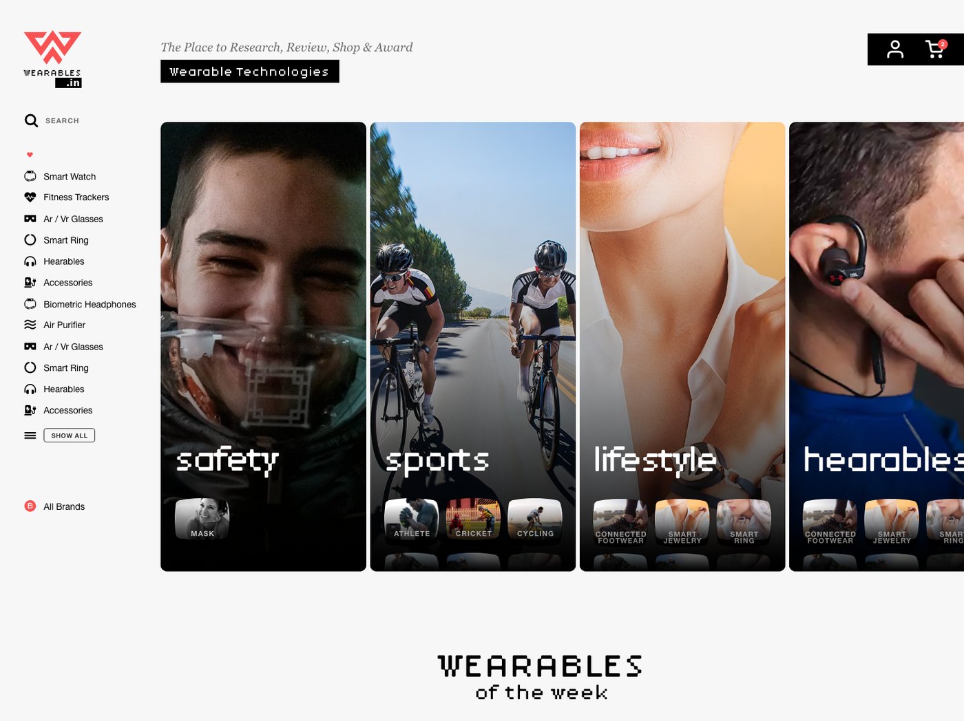


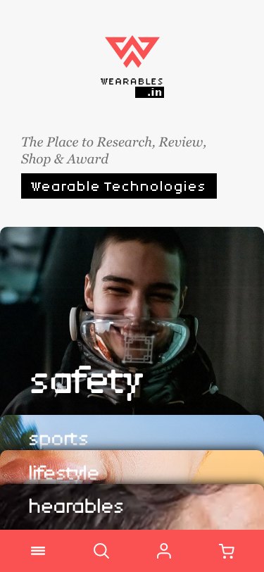
Each world carries its own sub categories as a tile grid inside it, so the second decision is made in the same gesture as the first. On a phone the columns become horizontal bands and the picture stays the label, because a name on its own is not enough to tell safety from lifestyle at a glance.
The product page
Built to answer the question, then ask for the card. Not the other way round.
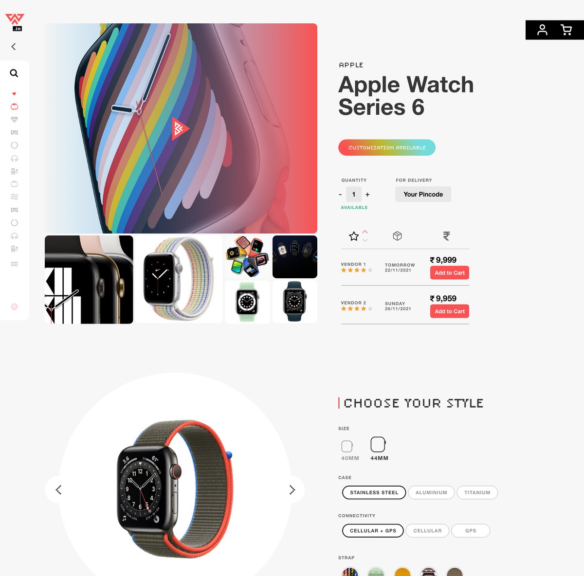
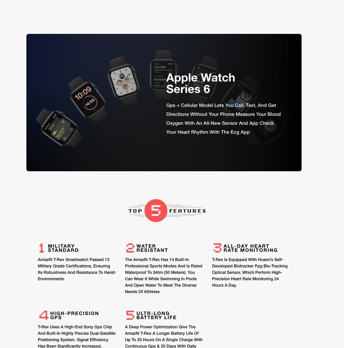
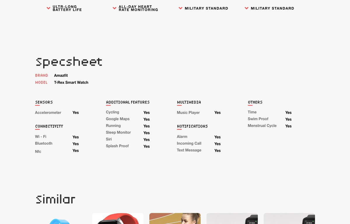
A person buying their first wearable is not comparing two models, they are deciding whether the whole idea is worth the money. So the page carries the argument: five features written as plain sentences, a full specsheet down to whether the sensor tracks a menstrual cycle, an editor's view, similar products at other prices, and a review form that is part of the page rather than a tab.
The vendor block sits at the top with the price and the delivery date next to each other, one row per seller. It is the only honest way to run a marketplace on a page that also claims to be a research tool.
The mark
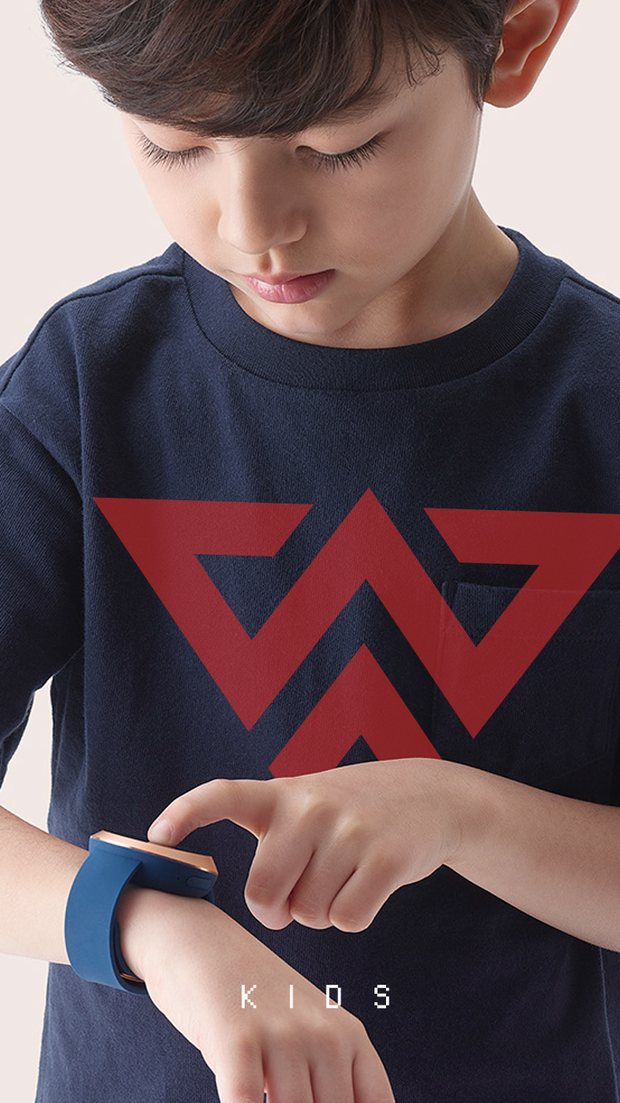
Two chevrons, cut from straight lines and right angles, with a pixel display face underneath it. Wearable technology is the first category where the screen is on your body, so the identity is made of the same unit the screen is made of.
It reads differently depending on where it lands, and that is the point rather than a problem. On water it is a wave. Over fire it is a warning. On a child's shirt it is a badge. The rule that keeps it from turning into chaos is simple. The mark never changes, the world always does.



Creative strategy
The brief was a storefront. The research kept turning up the same thing on the other side of it. Small companies with a finished product, a launch date and no room anywhere to put either. Virtual Space is the answer to that, and it is the piece of this project I would defend hardest, because nobody asked for it.
A partner puts a product into the world here. Photography, the story, the specs, the launch date and the price, filed once and appearing everywhere the storefront needs it.
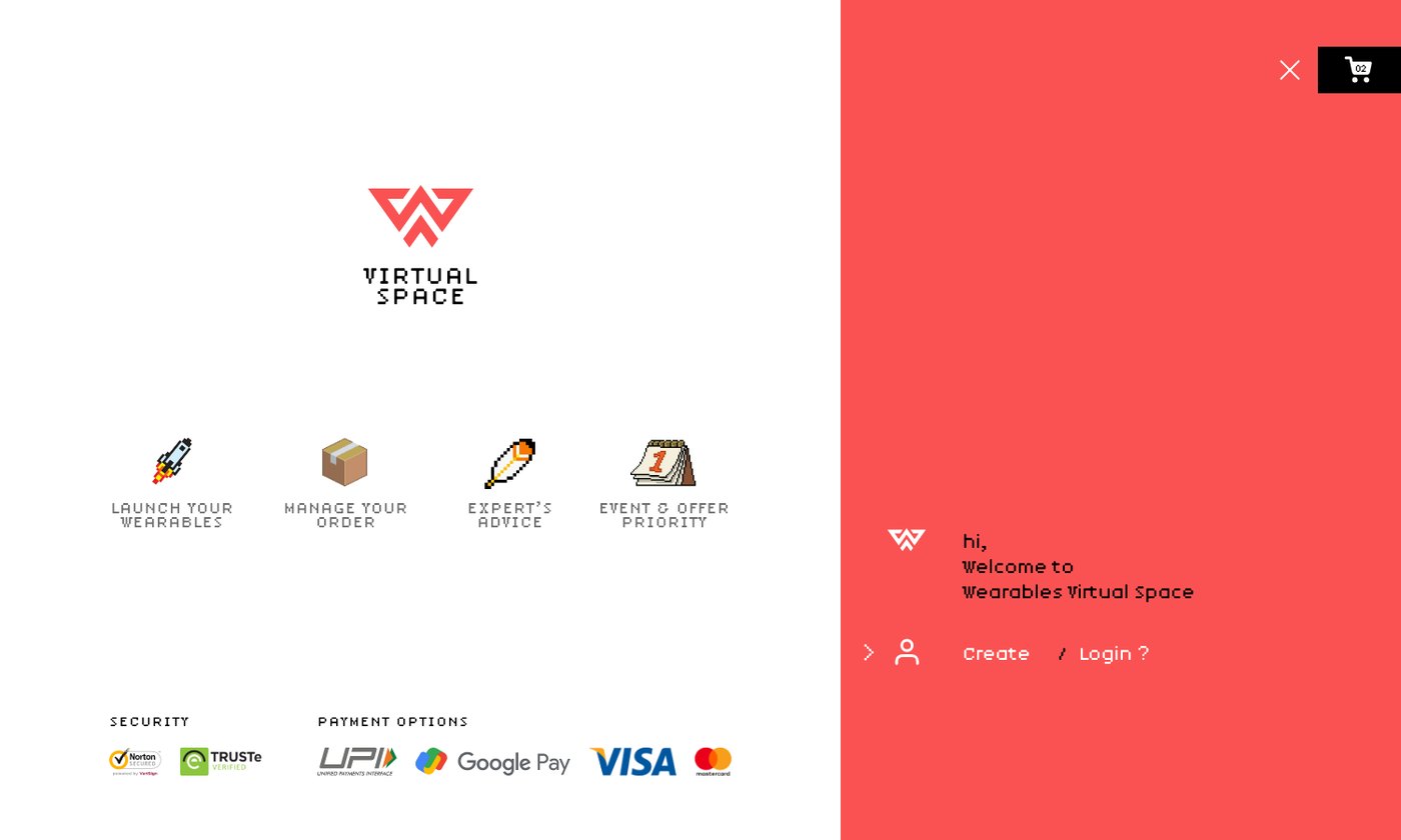
Two sides of one business, told apart by colour rather than by a different logo and a different name. A partner signs in and sees what has shipped, what is selling and what is being asked. A shopper never has to know this room exists.
How the work was done
What buyers type, and what they say out loud when nobody is making them use a product name. The gap between those two is where the four worlds came from.
Worlds on the stage, product types in the rail. Architecture that does not force a beginner and an expert down the same corridor.
The mark, the pixel display face, the coral and the black. Made so it survives at sixteen pixels on a watch face and at two metres on a launch banner, because on this category it has to do both. Colour carries the two sides of the business, white for the shopper and coral for the partner.
research · review · shop · award
Five features, specsheet, editor, reviews and vendors, ordered so the case is made before the price is asked for.
Virtual Space, drawn as a place rather than a dashboard, so launching feels like an event instead of a form. A marketplace only holds if both sides have a reason to stay.
What came out of it
Conversion tripled, engagement more than doubled, and the number that had been the real problem, people landing and leaving, fell from eight in ten to one in four.
Bounce is the honest measure for a category nobody has the words for yet. Eight out of ten arrivals used to look at the page and go, because the page asked them a question they could not answer. Four worlds is what changed that, and conversion and engagement followed it rather than the other way round.
The piece I would still point at is Virtual Space. It was not in the brief. It came out of the research turning up a supply side problem the storefront could not solve on its own, and it changed what the business was. A shop sells other people's products. A place where those products get launched, reviewed and awarded has a reason to exist that a shop does not.
Conversion rate, three times what it was
Bounce rate, down from 80 per cent
Increase in user engagement
Measured against the version this replaced.
Happy to walk through the category research, the routes that were rejected and how Virtual Space got made.